Summary
The Checkboxes field allows you to present one or many checkboxes which allow multiple selections. It is available under the Standard Fields section within the form editor.
Checkboxes field as displayed in the Field Library

Checkboxes field as displayed in the Form Editor.
Common Settings
This field uses only common field settings for the Appearance and Advanced settings. For a description of each of the common field settings, refer to this article. Below you will find a description of specialty settings that are particular to this field.
General Settings

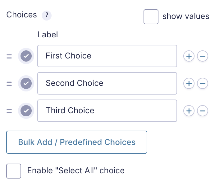
Click the Edit Choices button under Choices to open the Edit Choices flyout.
| Setting | Description |
|---|---|
| Choices | Add Choices to this field. You can mark each choice as checked by default by using the checkbox that appears to the left of each choice. Add a new choice by clicking the PLUS icon and delete a choice by clicking the DELETE icon. |
| Show Values | Checking this option will allow you to specify a value for each choice. Choice values are not displayed to the user viewing the form, but are accessible to administrators when viewing the entry. |
| Bulk Add / Predefined Choices | Clicking the Bulk Add / Predefined Choices allows you to select a category and customize the predefined choices or paste your own list to bulk add choices. See note 1. |
| Enable “Select All” choice | Checking this adds a Select All button to the bottom of the checkboxes list, allowing the user to select all available list items. |
Notes
1. See this article for more information.
Merge Tags
For more information on the use of merge tags, refer to these articles.
Usage
{Field Name:2.1:modifier1}
Notes:
- The field name is optional.
- The second parameter is the field ID. If a single number, it can be used to get the value of the field ID. If multiple numbers separated by a period, it will get a specific selection within that field. For example, 2 will return the result of field ID 2, while 2.1 will return the first checkbox within field ID 2.
- The third, and any subsequent parameters are used for modifiers. These are separated by a colon, and may contain multiple modifiers if applicable.
Modifiers
| Modifier | Description |
|---|---|
| :value | Displays the actual value of the checkbox rather than the value label. |
| :currency | Displays the value as currency. |
| :price | Same as :currency. |
Calculations
If you’re going to use this field type in a calculation formula, please check Number Formatting Rules in the Calculations doc page.