Getting There
Every form has its own group of settings. You can navigate to the Form Settings page a few different ways:
- From within the Form List view, hover over the form you want to review and then click or hover on the Settings link that appears below.
- From within the Form Editor for a particular form, hover or click on the Settings option in the top bar.
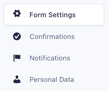
Settings Area
The Settings area contain access to the many form specific areas of your form. Form Settings is the top most option. Note that the content of this left hand menu may vary based on which add-ons you have installed.
Settings Sections
Each setting option within the Form Settings page is described below, categorized into the sections they appear in.
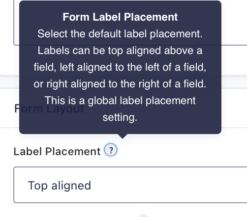
Note that you can get a quick tooltip about a form settings by hovering over the (?) “what is this” button on the settings page for a short tooltip.
Form Basics
These are the basic fields entered when you created your form.
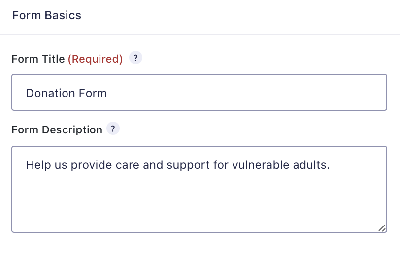
Title
Enter the title of your form. This will be helpful when you need to find it in the forms list.
Description
Enter a description for your form. This may be used for user instructions.
Form Layout
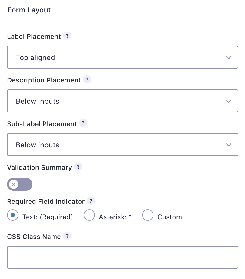
| Setting | Description |
|---|---|
| Label Placement | This defines where your field labels will appear, relative to the position of the input area of the field. Top aligned is above the field, left aligned is and right aligned to that respective side of the field. |
| Description Placement | Select the description placement. Descriptions can be placed above the field inputs or below the field inputs. Only available when Label Placement is set to “Top aligned”. This setting can be overridden by field specific settings. |
| Sub-Label Placement | Determines the placement of the sub-label. This setting can be overridden by field specific settings. |
| Validation Summary | If enabled, will show a summary that lists form validation errors at the top of the form when a user attempts a failed submission. |
| Required Field Indicator | Determines how you wish to indicate a required field. Options include the text “(required)”, an asterisk only, or a customer indicator where you can define the text to be displayed. |
| CSS Class Name | Enter the CSS class name you would like to use in order to override the default styles for this form. |
Form Button
Notice: As of Gravity Forms 2.6, the submit button is contained within the form editor, and all form button settings are offered there. Refer to this article for details.
This section defines the options available to manipulate the appearance of the button used to submit your form, applicable to Gravity Forms versions 2.5 and earlier.
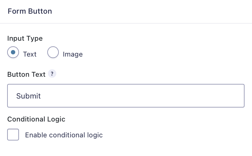
Input Type
Select Text or Image.
Text: type in what you would like to appear as the button text.
Image: to use an image as the button, select Image and enter the full path to the image you would like to use.
Conditional Logic
This option allows you to create rules to dynamically display or hide the submit button based on values from a field. Refer to this article for more on conditional logic. Note that hiding the submit button can cause usability issues, which can negatively affect the accessibility of your form. A warning message will be displayed to inform you of this.
Save and Continue
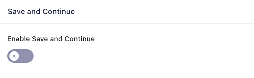
This checkbox allows you to enable a button in which the user can save their progress and continue at a later time. See this article more information on Save and Continue.
Restrictions
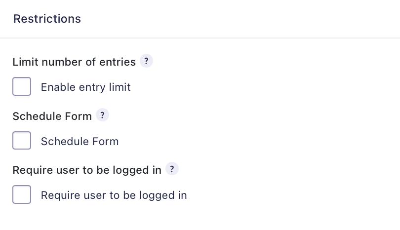
Limit number of entries
Enter a number in the input box below to limit the number of entries allowed for this form. The form will become inactive when that number is reached.
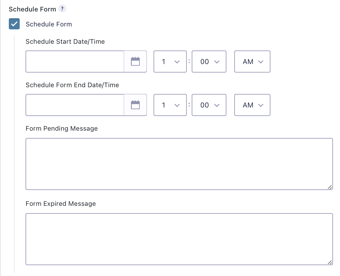
Schedule form
Schedule a time period the form is active. Checking this option also provides additional inputs for the Start Date and Time and End Date and time for the form schedule, along with Pending Message and Expired Message to display when the form is waiting to be displayed and after it has expired.
Require user to be logged in
Check this option to require a user to be logged in to view this form.
Require login message
Enter a message to be displayed to users who are not logged in. Shortcodes and HTML are allowed in this message so you can use a shortcode to call another form.
Form Options
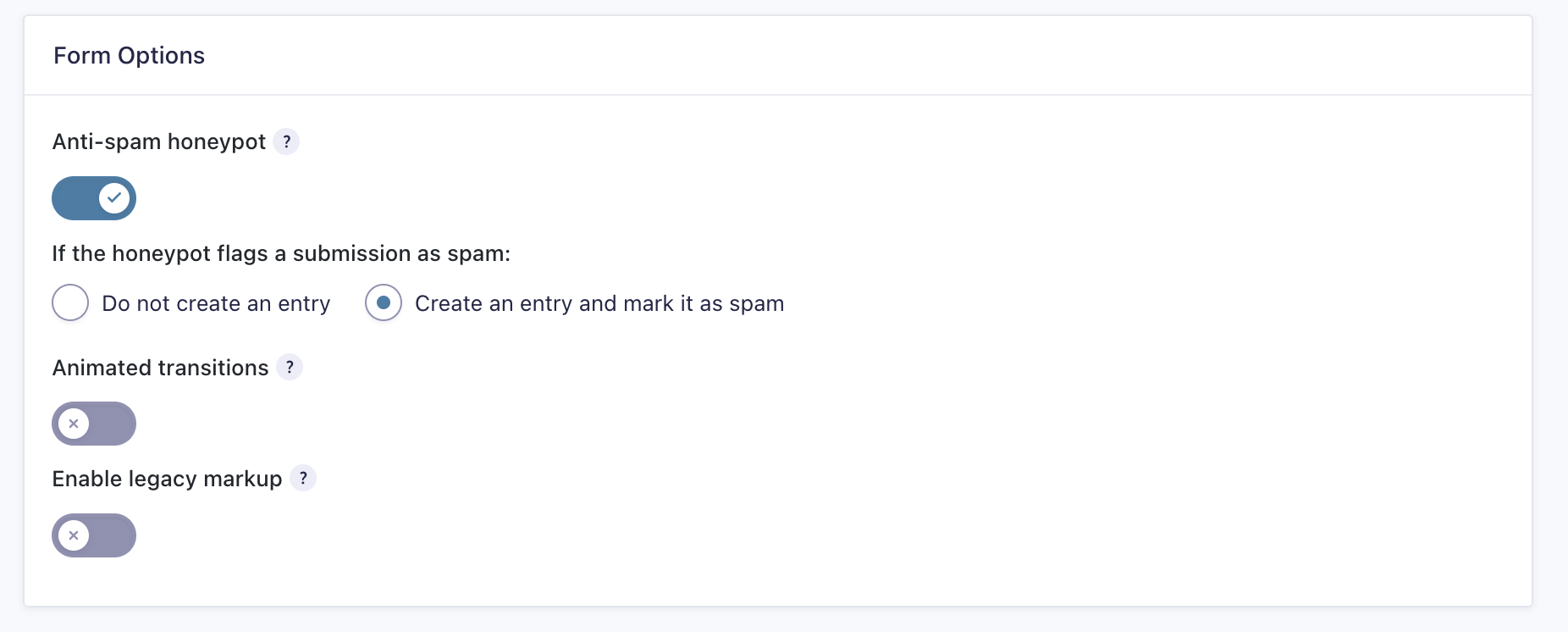
Enable Anti-spam honeypot
Checking this option will enable the honeypot spam protection technique, which is an alternative to the reCAPTCHA field. When enabled, the honeypot spam protection technique will function automatically and will not require any user interaction.
Once activated, there are two additional settings (requires Gravity Forms v2.7 or later):
- Do not create an entry
- Create an entry and mark it as spam
When selecting Do not create an entry, form submissions that are caught by the honeypot protection are not saved, and the form confirmation is processed as usual.
When selecting Create an entry and mark it as spam, form submissions that are caught by the honeypot protection are saved as entries but will be added to the Spam filter on the entries list page and the form confirmation will be processed as usual.
Enable Animated transitions
Checking this option will enable a sliding animation when displaying/hiding conditional logic fields. By default, the displaying/hiding of conditional logic fields has no animation; the fields are displayed/hidden instantly.
Enable legacy markup
Turning this option on will revert to pre-2.5 markup for your form. This option is enabled by default for forms that existed prior to you upgrading to 2.5. This option is off for all new forms.
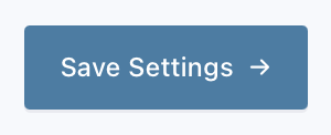
Save Settings
Don’t forget to click Save Settings once you are done to commit your form setting changes.