Summary
The Radio Buttons field allows users to select one option from a list. Only one option from the available choices can be selected. It is available under the Standard Fields section within the form editor.

Radio Buttons field as displayed in the Field Library

Radio Buttons field as displayed in the Form Editor.
Common Settings
This field uses only common field settings for the Appearance and Advanced settings. For a description of each of the common field settings, refer to this article. Below you will find description of specialty settings that are particular to this field.
General Settings

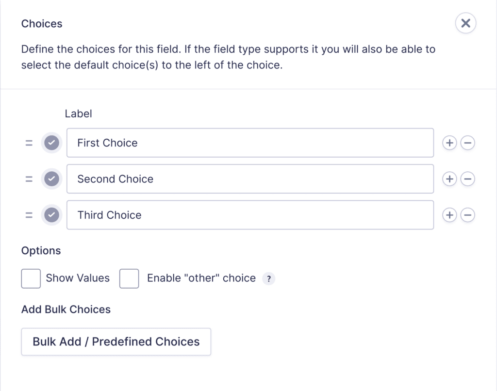
Click the Edit Choices button under Choices to open the Edit Choices flyout.
| Setting | Description |
|---|---|
| Choices | Add Choices to this field. You can mark each choice as checked by default by using the checkbox that appears to the left of each choice. Add a new choice by clicking the PLUS icon and delete a choice by clicking the DELETE icon. |
| Show Values | Allows you to specify a value for each choice. Choice values are not displayed to the user viewing the form but are accessible to administrators when viewing the entry. |
| Bulk Add / Predefined Choices | Allows you to select a category and customize the predefined choices or paste your own list to bulk add choices. See note 1. |
| Enable “Other” choice | Adds a text input as the final choice of your radio button field. This allows the user to specify a value that is not a predefined choice. |
Notes
1. See this article for more information.
Merge Tags
For more information on the use of merge tags, refer to these articles.
Usage
{Field Name:2.1:modifier}
Modifiers
| Modifier | Description |
|---|---|
| :value | Outputs the value of the field instead of the normal choice text. |
| :currency | Converts the value to a currency value. |
Calculations
If you’re going to use this field type in a calculation formula, please check Number Formatting Rules in the Calculations doc page.
Example: Changing the Button Display
The display of the radio button choices can be modified by using the gf_list category of CSS ready classes.
For example, to display the choices horizontally rather than vertically, enter the gf_list_inline CSS ready class in the field’s Custom CSS Class field under the Appearance tab.
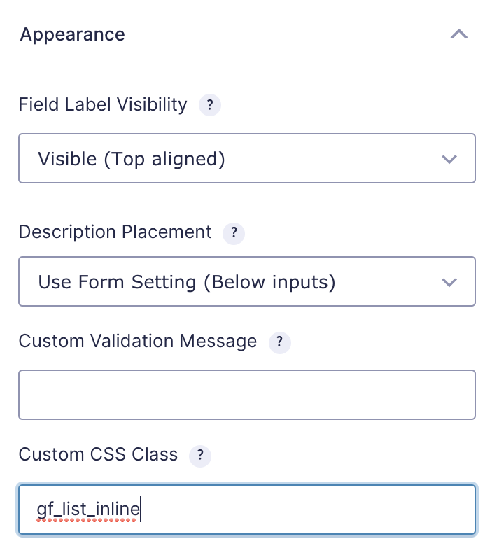
This turns a multiple choice list into an inline horizontal list (not evenly spaced columns).

Refer to this article for a list of CSS Ready Classes.