Introduction
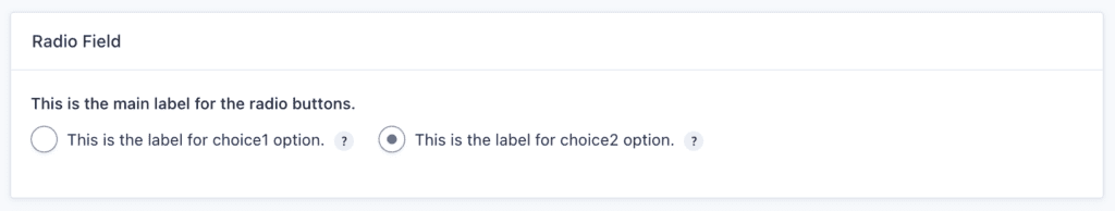
The radio type field, part of the Settings API, renders a radio type input for each of the field choices.
Example
The radio button has a default_value of “choice2value” so the second choice will be selected. Because horizontal is set to true, the radio buttons will be displayed side-by-side instead of the default one per line.
array(
    'title' => 'Radio Field',
    'fields' => array(
        array(
            'type'          => 'radio',
            'name'          => 'myradio',
            'label'         => esc_html__( 'This is the main label for the radio buttons.', 'sometextdomain' ),
            'default_value' => 'choice2value',
            'horizontal'    => true,
            'choices'       => array(
                array(
                    'name'    => 'choice1',
                    'tooltip' => esc_html__( 'This is the tooltip for choice1 option.', 'sometextdomain' ),
                    'label'   => esc_html__( 'This is the label for choice1 option.', 'sometextdomain' ),
                    'value'   => 'choice1value'
                ),
                array(
                    'name'    => 'choice2',
                    'tooltip' => esc_html__( 'This is the tooltip for choice2 option.', 'sometextdomain' ),
                    'label'   => esc_html__( 'This is the label for choice2 option.', 'sometextdomain' ),
                    'value'   => 'choice2value'
                ),
            )
        )
    )
)
The code above will render the radio button field similar to the following: