Summary
The Survey field is available when using the Survey add-on and simply allows you to create survey questions that users can answer. It is available under the Advanced Fields section within the form editor. If you do not already have the Survey add-on installed, you’ll need to do so before this field is available.

Survey field as displayed in the Field Library
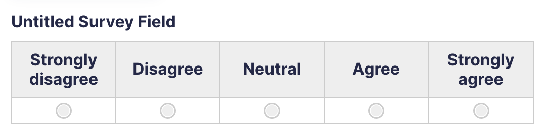
Survey field as displayed in the Form Editor, displaying the Likert choice type.
Common Settings
This field uses only common field settings for the Appearance and Advanced settings. For a description of each of the common field settings, refer to this article. Below you will find description of specialty settings that are particular to this field.
General Settings

Click the Edit Choices button under Choices to open the Edit Choices flyout. This will be visible for the Rank, Rating, Radio Buttons, Checkboxes and Drop Down Survey Field Type options below.
| Setting | Description |
|---|---|
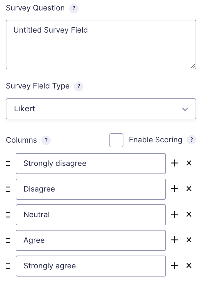
| Survey Question | This is simply the question that you would like to ask the user. |
| Survey Field Type | Determines how the survey field will be displayed to the user. See note below for options. |
| Columns/Choices | This is where you will define the individual answers for your survey field. |
Survey Field Type Options
This table lists the options available for displaying your survey field to a user.
| Option | Method of Choosing |
|---|---|
| Likert | Select items from a scale of options. For example, a scale of options from Strongly Disagree to Strongly Agree. See notes. |
| Rank | Rank items within a list by dragging and dropping elements into a top-to-bottom order. |
| Rating | Rate by stars. Each rating corresponds to a choice defined in the field settings. |
| Radio Buttons | Select one choice only by clicking a radio button. |
| Checkboxes | Select one or multiple choices using checkboxes. Enable “Select All” creates a choice for the user to select all other choices. |
| Single Line Text | Enter one line of custom text. See notes. |
| Paragraph Text | Similar to the Single Line Text option, but allows for multiple lines of input. Maximum Characters limits the number of characters this field is allowed to have. |
| Drop Down | Display choices in a dropdown box. Users can only select one. |
Notes
Additional Likert Options
Enable Multiple Rows allows multiples Likert questions to be asked in the same survey, basically increasing the number of rows in the Likert table.
Enable Scoring allows different scores for each column. Aggregate scores are displayed in the results page and can be used in merge tags.
Additional Single Line Text Options
Input Mask provides a visual guide allowing users to more easily enter data in a specific format such as dates and phone numbers. For more information on input masks, refer to this article.
Merge Tags
For more information on the use of merge tags, refer to these articles.
Usage
{Field Name:2}
Modifiers
This field type does not have any modifiers available.
Survey Specific Merge Tags
Survey related merge tags can only be used in confirmations and notifications.
| Tag | Description |
|---|---|
| {survey_total_score} | Displays the total score for the survey. Scoring must be enabled on the survey field for it to be tallied. |
| {score:id=x} | Displays the score for a specific survey question. Scoring must be enabled on the survey field for it to be tallied. |